You can format tables and crosstabs using similar techniques, some of which are performed directly on table columns.
Topics on This Page
Show or Hide the Grand Summary
Group Rows Based on Attributes
Add a Percentage Column for a Measure
Show or Hide the Grand Summary
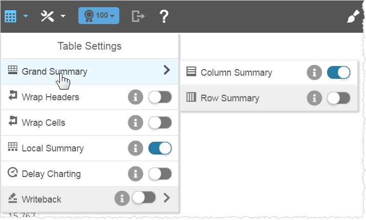
By default, Visualizer adds a Grand Summary at the bottom of measure columns.
- Click Table Settings → Grand Summary to enable a Grand Summary.

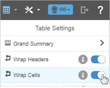
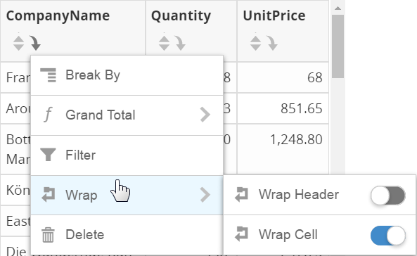
Wrap Headers and Cells
The Table Settings wrap options apply to entire tables or crosstabs. When headers are too long, enable Table Settings → Wrap Headers.
- For cells, enable Wrap Cells.
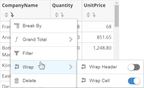
- Use the column formatting menu options to wrap headers and cells for individual columns.
Edit a Label
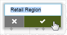
- Double-click the label of a column and type the new value,
then click the checkmark.
- Make any necessary changes to the label name.
- Click anywhere outside the label to save the changed name.
Change Column Width
The default column width is 95 pixels. The narrowest column width is 40 pixels.
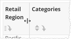
- Drag the column edge in the header to resize the width.
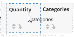
Reorder Columns
- Hover the cursor in a header. The Reorder icon displays, and the cursor changes to indicate that you have selected the column.
- Drag the column to another location. A blue bounding box displays where the column moves.
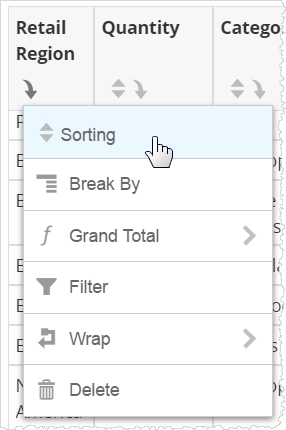
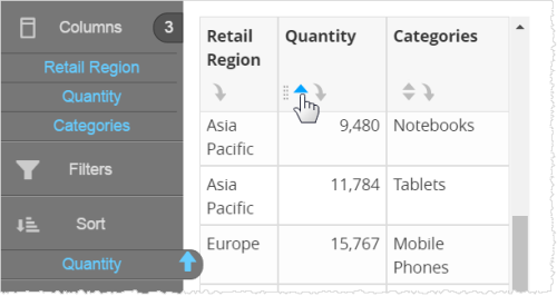
Sort Column Data
- In the column header, click Sort. Chart Builder adds the column
to the Sort section with an up arrow.

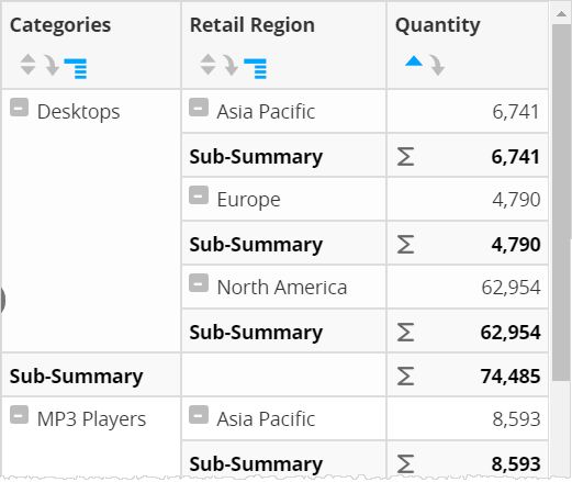
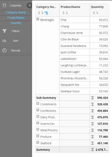
Group Rows Based on Attributes
- Click the Column menu to group the table rows based on attributes and view summaries for each group in a column in the column header.
- Select
Break By.
Break By adds collapse or expand buttons and subsummaries for each break. Click the hash mark by the category to collapse or expand the results in the table.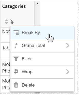 Note: To see a subsummary, your report must include at least one measure column.
 Tip: If you don't want to display subsummaries, you can turn them off using the Table Settings → Sub-Summary option.
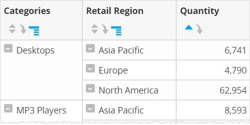
Collapse and Expand All Break By Report Sections
You can collapse all or expand all Break By categories.
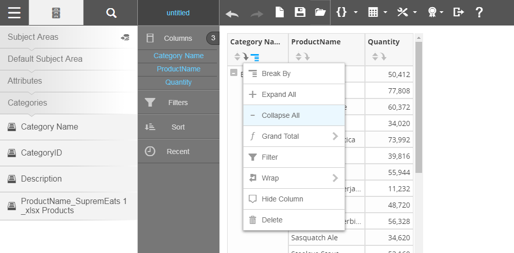
- Click the plus icon to expand the selected category.

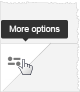
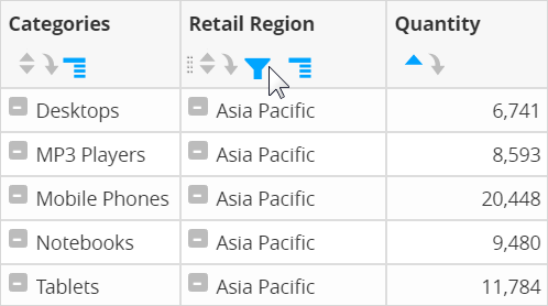
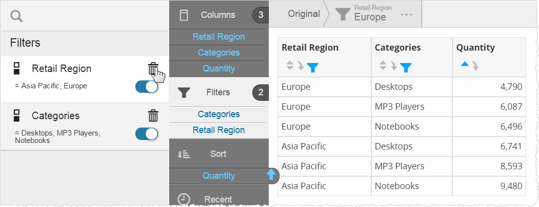
Filter Column Data
- In the column header, click the Column menu and select
Filter. The filter properties for the column display.
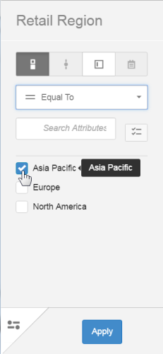
- Select from a variety of filter display options that match the type of data, such as checklist, slider, text input, or calendar.
- Select the filter operator. Visualizer lists the possible attribute values you can select for the filter. By default, the table filter is applied to the database.
- Enable Use as Display to apply the filter to the data in memory.
- Click Apply to view the table with the filter applied.
 Tips:
Tips:- To change the filter, click the filter icon in the column header.
- Drag-select
a set of rows to instantly filter a table.
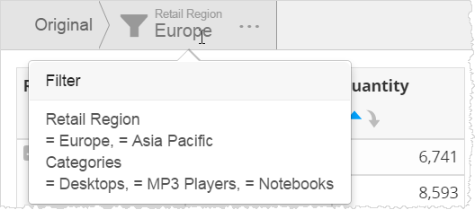
The filters that have been applied appear in the filter drill path. Hover the cursor to view the applied filters, and click on a node to return to a previous state.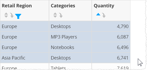
- To disable or delete a filter, click Filters in the Chart Builder.

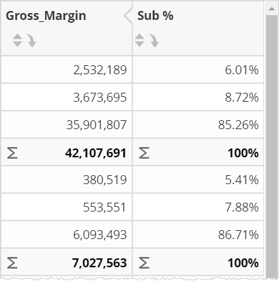
Add a Percentage Column for a Measure
Visualizer can automatically calculate percentages and create a percentage column for a measure.
- In the measure column header, click the Column menu
and select % of either the grand summary or a subsummary, if available.
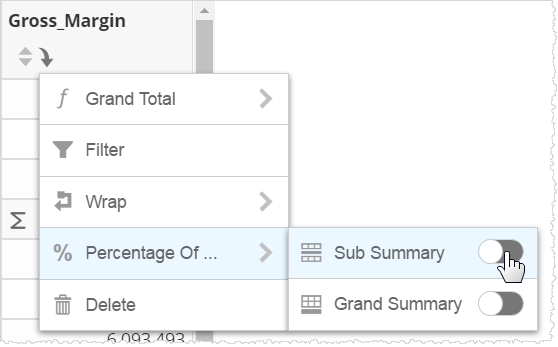
Visualizer adds a new percentage column next to the measure.
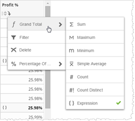
Use a Summary for a Column Based on an Expression
- Create a column based on an expression.
- Click the Grand Total menu for the column and select Expression.
Hide or Show a Column
- Click a column, then click Hide Column.
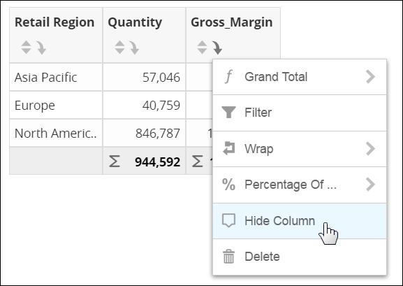
The column does not display in the table. However, it is still in the Chart Builder. Its name is disabled, but you can still view its related information in a pop-up when you hover over the name.
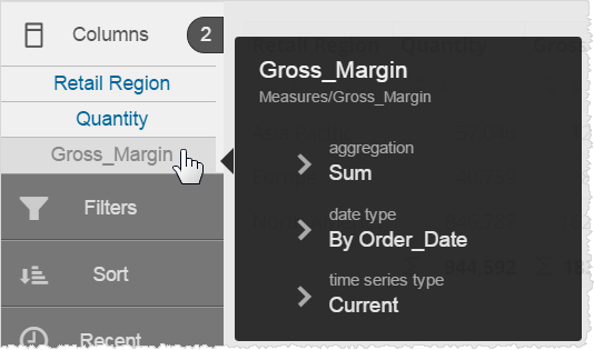
- To display the column, click the column name in the Chart Builder, then click Show Column.
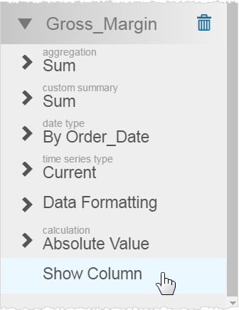
Use the column menu to hide columns you do not want to display.
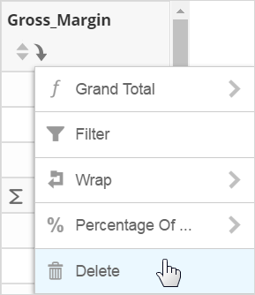
Delete a Column
- Click Delete in the column header to delete a column.
Format Table Summaries
Visualizer adds a Grand Summary at the bottom of measure columns by default.
- Click Show/Hide Table Summaries to enable or disable table summaries.
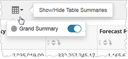 Tip: For crosstabs, you can control the visibility of row and grand summaries.
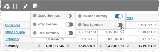
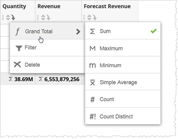
- In the column header, click the down arrow and select a Grand Total option to change
the default auto-summary for a measure column.
 Tip: To change the label of an auto-summary row, click Table Formatting.
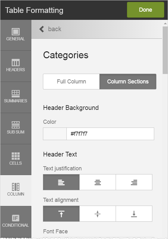
Change General Table Formatting
- To change table formatting, click Table Formatting.
As you select options in the Table Formatting panel, Visualizer previews the changes. Options include the following:
- Border on/off toggle, color and size
- Alternating rows on/off toggle, row colors
- Header background color
- Header text font, color, background color, size, style
- Summary background color
- Summary text font, color, background color, size, style
- Sub Summary background color
- Sub Summary text font, color, background color, size, style
- Cell text font, color, background color, size, style
- Per-column formatting, either the whole column or sections (header, summary, sub summary, cells)
Note: Many of these options are not available for crosstabs, even though they appear in the options. - Click Done.
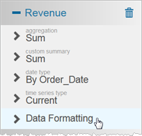
- Click the measure in Columns and select the Data Formatting option to specify
the number of decimal places or add a currency symbol for a measure.
- Click Save.